Creative Ways to Mix Tile Colors Like a Designer
We know already that this year is particularly famous for its bold and vibrant use of color. But are you unsure about which tile color pairings to use when renovating your home? Today, we’ll show you how to play with color like an interior designer and bring your personality to life. Let’s dive into the world of color together!
The Power of Color in Tile Design
Of course, the materials you choose are crucial factors, including how long you’ll use them, their ease of maintenance, and their appearance. However, we’d be making a huge mistake if we overlooked the importance of color.
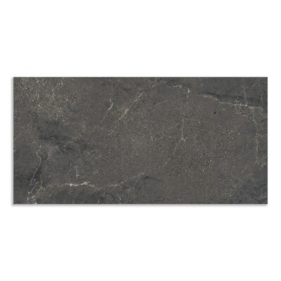
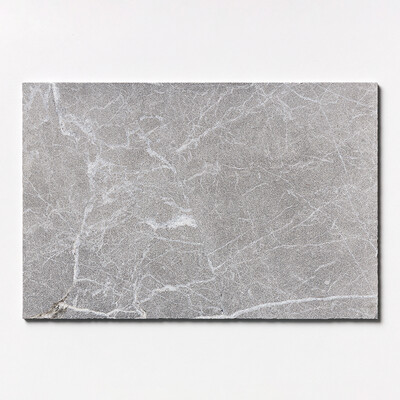
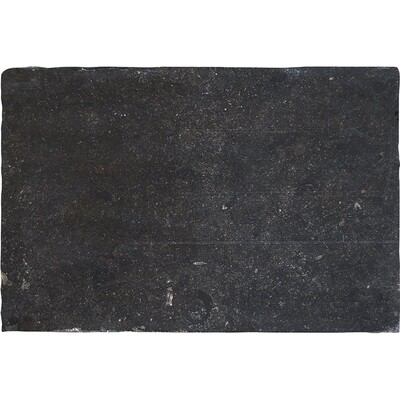
Colors tell us how we feel about a space when we look at it. Darker hues, such as black tiles, are often used to create moody or industrial designs, while neutral and light palettes are preferred by clients who want to make small spaces appear larger or by those who believe these colors always convey a timeless elegance.
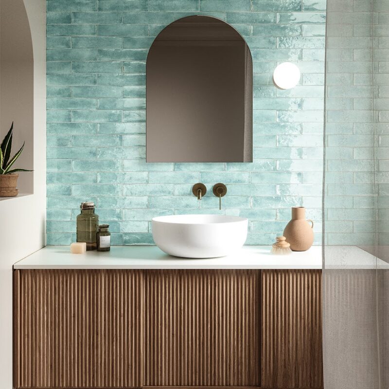
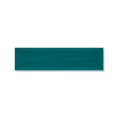
At this point, using colors together with the right strategies is crucial. For example, it’s almost universally known that the color blue has a calming effect. If you want to feel at ease in your bathroom, you can double the tranquility by incorporating blue tiles into it. This is just one example!
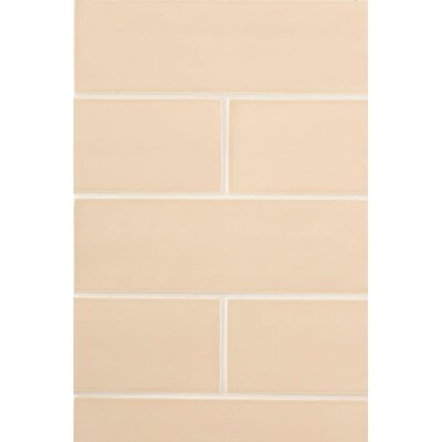
Combine Warm and Cool: Song of Ice and Fire
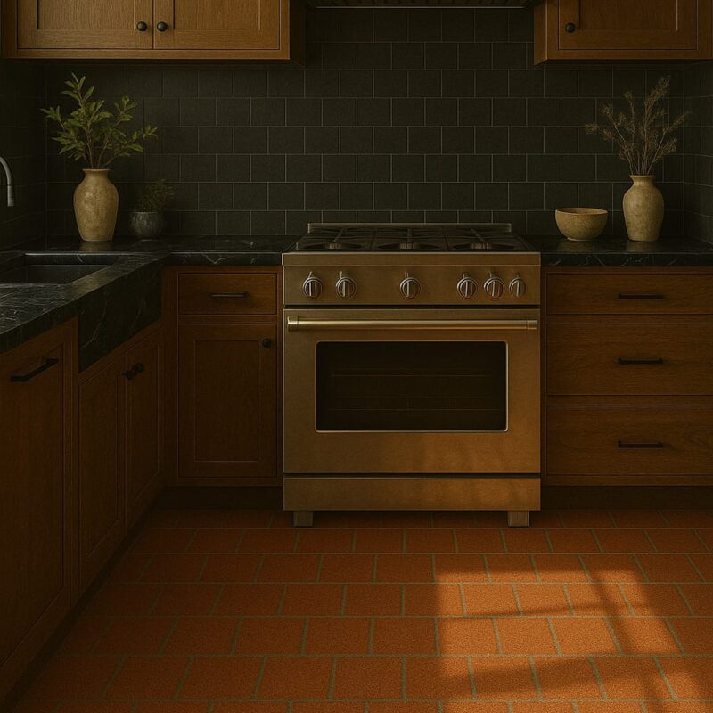
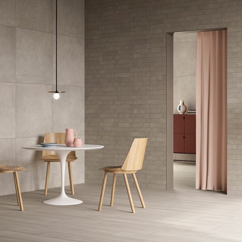
Yes, we really get you. Mixing warm and cool tones might sound risky. But when done right, warm and cool tile combinations can create rich, layered interiors that feel curated rather than chaotic. Picture this: terracotta floor tiles paired with a cool gray or soft sage backsplash. It’s a striking contrast that brings out the best of both palettes.
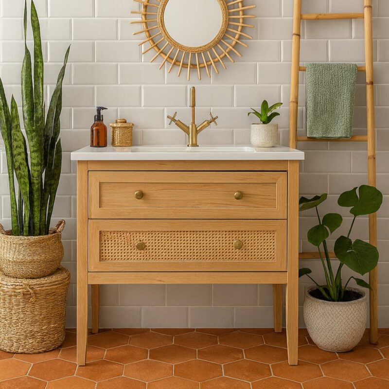
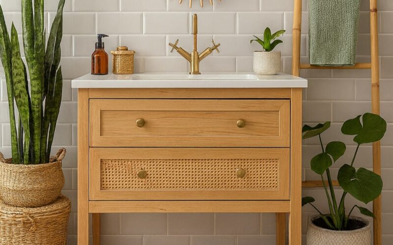
So, how to mix tile colors like a designer? Be bold, but intentional, don’t throw tiles around you like they have no meaning. Transitional tones are your best friend. Bridge the gap between warm and cool hues with neutrals, think creams, beiges, or stone-inspired shades. These subtle bridges ensure your palette flows naturally. Combinations like this are effective in bathrooms, where strategic use of tile color can dramatically change a small space, just like your tiny laundry room.

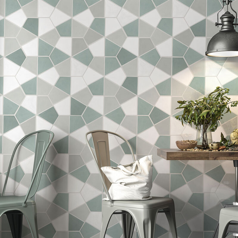
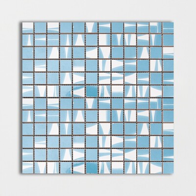
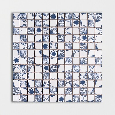
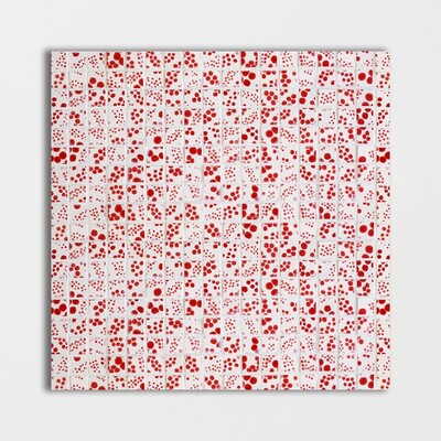
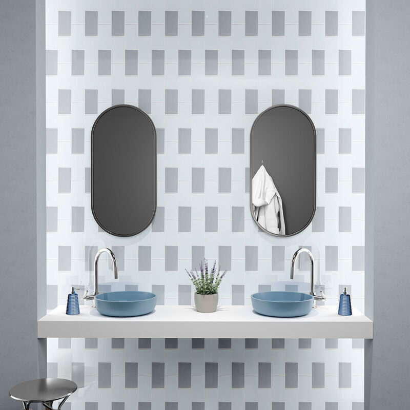
Use Patterns and Mosaics to Blend Colors Seamlessly
One of the most playful ways to unify a space? Let’s give a chance to patterns and mosaic tiles. These designs allow multiple tile colors to co-exist beautifully, creating cohesion through repetition and scale. They’re especially magical when working with organic textures like zellige tile colors. Think about the imperfections, the colors, and the texture imperfections. And that’s the perfection you need.
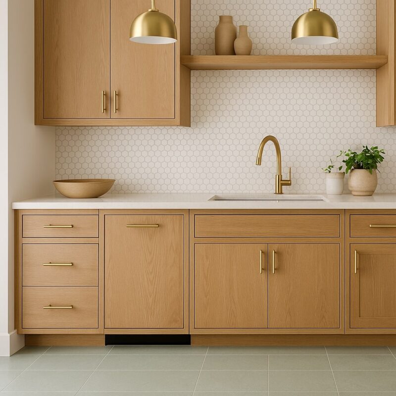
Want a kitchen that feels like a magazine cover yet approachable? Try a mix of soft sage green with matte white mosaic tiles, easily one of the best tile color combinations for kitchens this year. The trick is to blend textures and tones subtly, letting the pattern do the heavy lifting.
If you’re wondering how to mix tile patterns and colors, think harmony over uniformity. Use accent walls, backsplash tiles, or even fireplace surrounds to experiment, while keeping the larger surfaces more restrained.
Stick to the 60-30-10 Rule for Balance
Feeling overwhelmed by choices? Interior designers swear by the 60-30-10 design rule, and for good reason. It’s a foolproof formula: 60% dominant color, 30% secondary, and 10% accent.
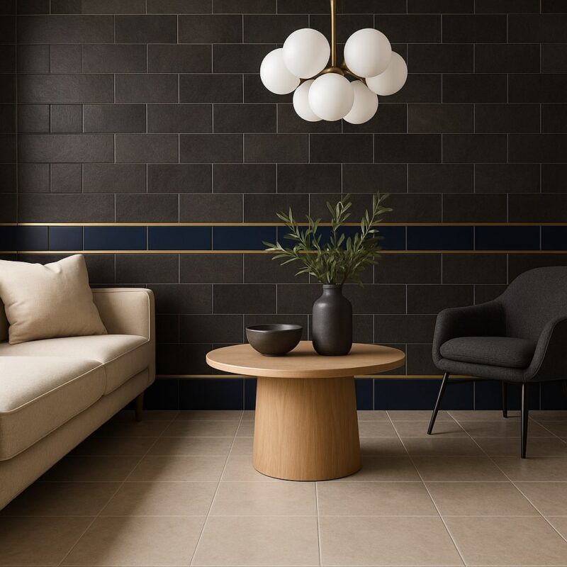
Let’s say you’re designing a living room. You might try neutral floor tile colors as your base (60%), layer in deep charcoal wall tiles (30%), and then introduce a pop of navy or brass through decorative tile trims (10%). Voilà! Balance, without overthinking.
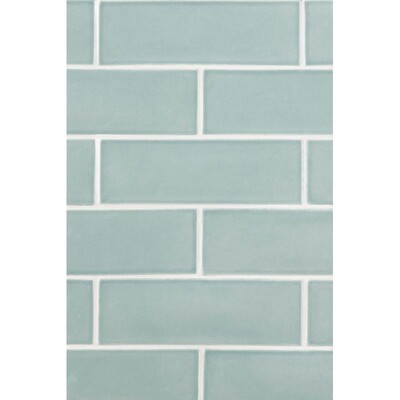
Try Tone on Tone for a Sophisticated Look
Nothing is better than a sophistication quite like a tone-on-tone tile design. This interior’s approach involves layering different shades of the same color family, creating a nuanced, monochromatic look that feels effortlessly chic.
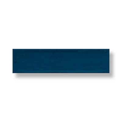
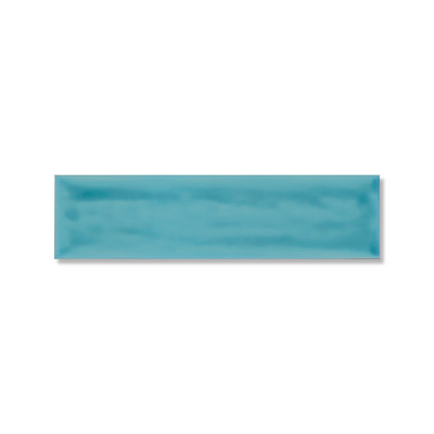
Think blue shades from a cloud blue to navy, or varying shades of olive green on walls and floors. This technique works beautifully with both modern and traditional interior styles and is a staple in many modern tile color schemes.
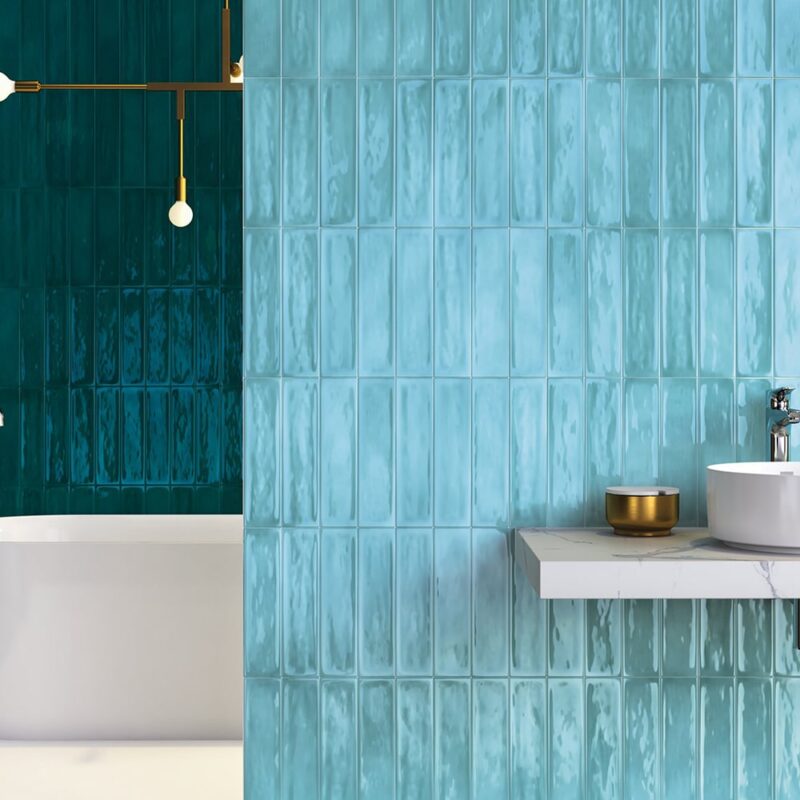
The secret to making tone-on-tone work? Contrast through texture. Try pairing matte and glossy finishes or mixing ceramic tile colors with natural stone for dimension. It’s minimal, but never boring.
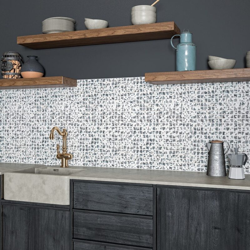
Avoid Common Mistakes When Mixing Tile Colors
While experimenting is encouraged, there are a few issues to avoid while using different tile colors. One of the most common? Choosing multiple marble tile colors or subway tile colors that clash rather than complement. Without a clear visual anchor, the space can feel chaotic, like you’ve put any tile you’ve found on your wall.
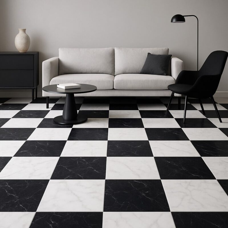
Another common misstep? Ignoring contrast. Even if you’re using muted tones, contrast is key, whether in color, scale, or texture. If you’re into high-impact looks, give a chance to bold pairings like black and white tiles, but ground them with simple design elements elsewhere in the space.
A final word of advice: know your vibe and express your aesthetic understanding well. Your tile choices should reflect your personality just as much as your design preferences. A well-designed home doesn’t just look good, it feels like you.


Stay Inspired by Stone Tile Depot’s Colorful Collections
What if we told you we have endless color options, so many you’ve never even considered? If you’re on a budget, check out our discount tile selection! Or, if you’re eager to make a quick change, visit our nearest tile showroom and see and experience the options.